Clipboard
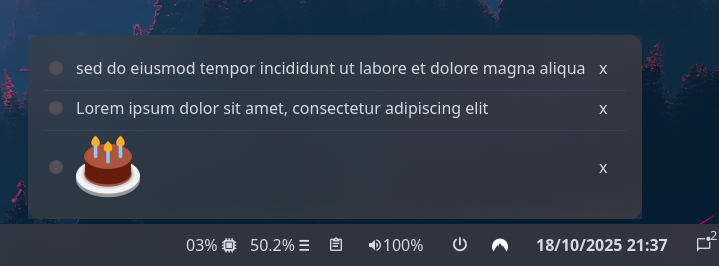
Shows recent clipboard items, allowing you to switch between them to re-copy previous values. Clicking the icon button opens the popup containing all functionality.
Supports plain text and images.
Example
{ end = [ { type = "clipboard" max_items = 3 truncate.mode = "end" truncate.length = 50 } ]}{ "end": [ { "type": "clipboard", "max_items": 3, "truncate": { "mode": "end", "length": 50 } } ]}end: - type: clipboard max_items: 3 truncate: mode: end length: 50[[end]]type = "clipboard"max_items = 3
[end.truncate] mode = "end" length = 50Configuration
Type:
clipboard
The icon to show on the bar widget button. Supports image icons.
Type: string
Default:
icon_size
Section titled “icon_size”The size to render the icon at. Note this only applies to image-type icons.
Type: integer
Default: 32
image_max_height
Section titled “image_max_height”The maximum height to render copied images at.
Type: number
Default: 64
image_max_width
Section titled “image_max_width”The maximum width to render copied images at.
Type: number
Default: 256
justify
Section titled “justify”The justification (alignment) of the widget text shown on the bar.
Type: 'left' | 'right' | 'center' | 'fill'
Default: 'left'
max_items
Section titled “max_items”The maximum number of items to keep in the history, and to show in the popup.
Type: integer
Default: 10
orientation
Section titled “orientation”The orientation to display the widget contents. Setting to vertical will rotate text 90 degrees.
Type: 'horizontal' | 'vertical'
Default: 'horizontal'
truncateEnum
Section titled “truncateEnum”See truncate options.
Default: None
Do not truncate content.
Setting this option may cause excessively long content to overflow other widgets, shifting them off-screen.
Example
Section titled “Example”{ truncate = "off" }{ "truncate": "off"}truncate: offtruncate = "off"2'none' | 'start' | 'middle' | 'end'
Section titled “2'none' | 'start' | 'middle' | 'end'”Auto mode lets GTK decide when to ellipsize.
To use this mode, set the truncate option to a string declaring the location to truncate text from and place the ellipsis.
Example
Section titled “Example”{ truncate = "start" }{ "truncate": "start"}truncate: starttruncate = "start"3object
Section titled “3object”Length mode defines a fixed point at which to ellipsize.
Generally you will want to set only one of length or max_length,
but you can set both if required.
Example
Section titled “Example”{ truncate.mode = "start" truncate.length = 50 truncate.max_length = 70}{ "truncate": { "mode": "start", "length": 50, "max_length": 70 }}truncate: mode: start length: 50 max_length: 70[truncate]mode = "start"length = 50max_length = 70Object keys
object.length
Section titled “object.length”The fixed width (in characters) of the widget.
The widget will be expanded to this width if it would have otherwise been smaller.
Leave unset to let GTK automatically handle.
Type: integer
Default: None
object.max_length
Section titled “object.max_length”The maximum number of characters to show before truncating.
Leave unset to let GTK automatically handle.
Type: integer
Default: None
object.modeRequired
Section titled “object.modeRequired”The location to truncate text from and place the ellipsis.
Type: 'none' | 'start' | 'middle' | 'end'
Default: None
Styling
| Selector | Description |
|---|---|
.clipboard | Clipboard widget. |
.clipboard .btn | Clipboard widget button. |
.clipboard .btn .icon | Clipboard widget button icon (any type). |
.clipboard .btn .text-icon | Clipboard widget button icon (textual only). |
.clipboard .btn .image | Clipboard widget button icon (image only). |
.popup-clipboard | Clipboard popup box. |
.popup-clipboard .item | Clipboard row item inside the popup. |
.popup-clipboard .item .btn | Clipboard row item radio button. |
.popup-clipboard .item .btn.text | Clipboard row item radio button (text values only). |
.popup-clipboard .item .btn.image | Clipboard row item radio button (image values only). |
.popup-clipboard .item .btn-remove | Clipboard row item remove button. |
For more information on styling, please see the styling guide.