Bluetooth
Displays the current bluetooth status. Clicking on the widget opens a popout displaying list of available devices and connection controls.
Example
{ end = [ { type = "bluetooth" icon_size = 32 format.not_found = "" format.disabled = " Off" format.enabled = " On" format.connected = " {device_alias}" format.connected_battery = " {device_alias} • {device_battery_percent}%" popup.max_height.devices = 5 popup.header = " Enable Bluetooth" popup.disabled = "{adapter_status}" popup.device.header = "{device_alias}" popup.device.header_battery = "{device_alias}" popup.device.footer = "{device_status}" popup.device.footer_battery = "{device_status} • Battery {device_battery_percent}%" adapter_status.not_found = "No Bluetooth adapters found" adapter_status.enabled = "Bluetooth enabled" adapter_status.enabling = "Enabling Bluetooth..." adapter_status.disabled = "Bluetooth disabled" adapter_status.disabling = "Disabling Bluetooth..." device_status.connected = "Connected" device_status.connecting = "Connecting..." device_status.disconnected = "Disconnect" device_status.disconnecting = "Disconnecting..." } ]}{ "end": [ { "type": "bluetooth", "icon_size": 32, "format": { "not_found": "", "disabled": " Off", "enabled": " On", "connected": " {device_alias}", "connected_battery": " {device_alias} • {device_battery_percent}%" }, "popup": { "max_height": { "devices": 5 }, "header": " Enable Bluetooth", "disabled": "{adapter_status}", "device": { "header": "{device_alias}", "header_battery": "{device_alias}", "footer": "{device_status}", "footer_battery": "{device_status} • Battery {device_battery_percent}%" } }, "adapter_status": { "not_found": "No Bluetooth adapters found", "enabled": "Bluetooth enabled", "enabling": "Enabling Bluetooth...", "disabled": "Bluetooth disabled", "disabling": "Disabling Bluetooth..." }, "device_status": { "connected": "Connected", "connecting": "Connecting...", "disconnected": "Disconnect", "disconnecting": "Disconnecting..." } } ]}end: - type: bluetooth icon_size: 32 format: not_found: "" disabled: Off enabled: On connected: {device_alias} connected_battery: {device_alias} • {device_battery_percent}% popup: max_height: devices: 5 header: Enable Bluetooth disabled: "{adapter_status}" device: header: "{device_alias}" header_battery: "{device_alias}" footer: "{device_status}" footer_battery: "{device_status} • Battery {device_battery_percent}%" adapter_status: not_found: No Bluetooth adapters found enabled: Bluetooth enabled enabling: Enabling Bluetooth... disabled: Bluetooth disabled disabling: Disabling Bluetooth... device_status: connected: Connected connecting: Connecting... disconnected: Disconnect disconnecting: Disconnecting...[[end]]type = "bluetooth"icon_size = 32
[end.format] not_found = "" disabled = " Off" enabled = " On" connected = " {device_alias}" connected_battery = " {device_alias} • {device_battery_percent}%"
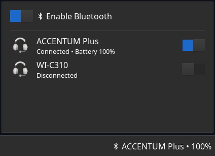
[end.popup] header = " Enable Bluetooth" disabled = "{adapter_status}"
[end.popup.max_height] devices = 5
[end.popup.device] header = "{device_alias}" header_battery = "{device_alias}" footer = "{device_status}" footer_battery = "{device_status} • Battery {device_battery_percent}%"
[end.adapter_status] not_found = "No Bluetooth adapters found" enabled = "Bluetooth enabled" enabling = "Enabling Bluetooth..." disabled = "Bluetooth disabled" disabling = "Disabling Bluetooth..."
[end.device_status] connected = "Connected" connecting = "Connecting..." disconnected = "Disconnect" disconnecting = "Disconnecting..."Configuration
Type:
bluetooth
adapter_status
Section titled “adapter_status”Values of {adapter_status} formatting token.
Default: None
Object keys
adapter_status.disabled
Section titled “adapter_status.disabled”The value of {adapter_status} formatting token when adapter is disabled.
Type: string
Default: Bluetooth disabled
adapter_status.disabling
Section titled “adapter_status.disabling”The value of {adapter_status} formatting token when adapter is disabling.
Type: string
Default: Disabling Bluetooth...
adapter_status.enabled
Section titled “adapter_status.enabled”The value of {adapter_status} formatting token when adapter is enabled.
Type: string
Default: Bluetooth enabled
adapter_status.enabling
Section titled “adapter_status.enabling”The value of {adapter_status} formatting token when adapter is enabling.
Type: string
Default: Enabling Bluetooth...
adapter_status.not_found
Section titled “adapter_status.not_found”The value of {adapter_status} formatting token when adapter not found.
Type: string
Default: No Bluetooth adapters found
device_status
Section titled “device_status”Values of {device_status} formatting token.
Default: None
Object keys
device_status.connected
Section titled “device_status.connected”The value of {device_status} formatting token when device is connected.
Type: string
Default: Connected
device_status.connecting
Section titled “device_status.connecting”The value of {device_status} formatting token when device is connecting.
Type: string
Default: Connecting...
device_status.disconnected
Section titled “device_status.disconnected”The value of {device_status} formatting token when device is disconnected.
Type: string
Default: Disconnected
device_status.disconnecting
Section titled “device_status.disconnecting”The value of {device_status} formatting token when device is disconnecting.
Type: string
Default: Disconnecting...
format
Section titled “format”Format strings for on-bar button.
Default: None
Object keys
format.connected
Section titled “format.connected”Format string to use for the widget button when bluetooth adapter is enabled and a device is connected.
Type: string
Default: {device_alias}
format.connected_battery
Section titled “format.connected_battery”Format string to use for the widget button when bluetooth adapter is enabled, a device is connected and {device_battery_percent} is available.
Type: string
Default: {device_alias} • {device_battery_percent}%
format.disabled
Section titled “format.disabled”Format string to use for the widget button when bluetooth adapter is disabled.
Type: string
Default: Off
format.enabled
Section titled “format.enabled”Format string to use for the widget button when bluetooth adapter is enabled but no devices are connected.
Type: string
Default: On
format.not_found
Section titled “format.not_found”Format string to use for the widget button when bluetooth adapter not found.
Type: string
Default: None
icon_size
Section titled “icon_size”Size to render the icons at, in pixels (image icons only).
Type: integer
Default: 32
Popup related configuration.
Default: None
Object keys
popup.device
Section titled “popup.device”Device box related configuration
Default: None
Object keys
popup.device.footer
Section titled “popup.device.footer”Format string to use for the footer of device box.
Type: string
Default: {device_status}
popup.device.footer_battery
Section titled “popup.device.footer_battery”Format string to use for the footer of device box when {device_battery_percent} is available.
Type: string
Default: {device_status} • Battery {device_battery_percent}%
popup.device.header
Section titled “popup.device.header”Format string to use for the header of device box.
Type: string
Default: {device_alias}
popup.device.header_battery
Section titled “popup.device.header_battery”Format string to use for the header of device box when {device_battery_percent} is available.
Type: string
Default: {device_alias}
popup.disabled
Section titled “popup.disabled”Format string to use for the message that is displayed when the adapter is not found or disabled.
Type: string
Default: {adapter_status}
popup.header
Section titled “popup.header”Format string to use for the header of popup window.
Type: string
Default: Enable Bluetooth
popup.max_heightEnum
Section titled “popup.max_heightEnum”The maximum height the window can reach before scrolling.
Specify either as pixels or devices.
Leave blank to allow the popup to grow indefinitely.
Default: None
1object
Section titled “1object”No description provided.
Object keys
2object
Section titled “2object”No description provided.
Object keys
Styling
| Selector | Description |
|---|---|
.bluetooth | Tray widget button |
.bluetooth.not-found | Tray widget button when bluetooth adapter not found |
.bluetooth.disabled | Tray widget button when bluetooth adapter is disabled |
.bluetooth.enabled | Tray widget button when bluetooth adapter is enabled but no devices are connected |
.bluetooth.connected | Tray widget button when bluetooth adapter is enabled and a device is connected |
.popup-bluetooth | Popup box |
.popup-bluetooth .header | Header box with switch and label |
.popup-bluetooth .header .switch | Bluetooth enable/disable switch |
.popup-bluetooth .header .label | Bluetooth enable/disable label |
.popup-bluetooth .disabled | Box that is only shown in non-enabled states (e.g. disabled, adapter not found, etc) |
.popup-bluetooth .disabled .spinner | Spinner that is only shown in “connecting” and “disconnecing” states |
.popup-bluetooth .disabled .label | Label inside disabled container |
.popup-bluetooth .devices | Devices scrollwindow |
.popup-bluetooth .devices .box | Box inside devices scrollwindow |
.popup-bluetooth .devices .box .device | Device box |
.popup-bluetooth .devices .box .device .icon-box | Device icon box |
.popup-bluetooth .devices .box .device .icon-box .icon | Device icon content (any type) |
.popup-bluetooth .devices .box .device .icon-box .text-icon | Device icon content (textual only) |
.popup-bluetooth .devices .box .device .icon-box .image | Device icon content (image only) |
.popup-bluetooth .devices .box .device .status | Device status box |
.popup-bluetooth .devices .box .device .status .header-label | Device header label |
.popup-bluetooth .devices .box .device .status .footer-label | Device footer label |
.popup-bluetooth .devices .box .device .switch | Device connect/disconnect switch |
.popup-bluetooth .devices .box .device .spinner | Spinner that is only shown in “connecting” and “disconnecing” states |
For more information on styling, please see the styling guide.