Notifications
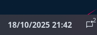
Displays information about the current SwayNC state such as notification count and DnD. Clicking the widget opens the SwayNC panel.
Example
{ end = [ { type = "notifications" show_count = true
icons.closed_none = "" icons.closed_some = "" icons.closed_dnd = "" icons.open_none = "" icons.open_some = "" icons.open_dnd = "" } ]}{ "end": [ { "type": "notifications", "show_count": true, "icons": { "closed_none": "", "closed_some": "", "closed_dnd": "", "open_none": "", "open_some": "", "open_dnd": "" } } ]}end: - type: notifications show_count: true icons: closed_none: closed_some: closed_dnd: open_none: open_some: open_dnd: [[end]]type = "notifications"show_count = true
[end.icons] closed_none = "" closed_some = "" closed_dnd = "" open_none = "" open_some = "" open_dnd = ""Configuration
Type:
notifications
SwayNC state icons.
See icons.
Default: None
Object keys
icons.closed_dnd
Section titled “icons.closed_dnd”Icon to show when the panel is closed, with DnD enabled. Takes higher priority than count-based icons.
Type: string
Default:
icons.closed_none
Section titled “icons.closed_none”Icon to show when the panel is closed, with no notifications.
Type: string
Default:
icons.closed_some
Section titled “icons.closed_some”Icon to show when the panel is closed, with notifications.
Type: string
Default:
icons.open_dnd
Section titled “icons.open_dnd”Icon to show when the panel is open, with DnD enabled. Takes higher priority than count-based icons.
Type: string
Default:
icons.open_none
Section titled “icons.open_none”Icon to show when the panel is open, with no notifications.
Type: string
Default:
icons.open_some
Section titled “icons.open_some”Icon to show when the panel is open, with notifications.
Type: string
Default:
show_count
Section titled “show_count”Whether to show the current notification count.
Type: boolean
Default: true
Styling
| Selector | Description |
|---|---|
.notifications | Notifications widget container |
.notifications .button | Notifications widget button |
.notifications .count | Notifications count indicator overlay |
For more information on styling, please see the styling guide.