Music
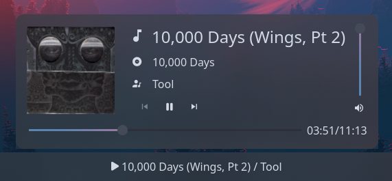
Displays currently playing song from your music player. This module supports both MPRIS players and MPD servers. Clicking on the widget opens a popout displaying info about the current song, album art and playback controls.
in MPRIS mode, the widget will listen to all players and automatically detect/display the active one.
Use truncate or marquee options to control how long titles are shown on the bar and popup.
Example
{ start = [ { type = "music" player_type = "mpd" format = "{title} / {artist}" truncate = "end" icons.play = "" icons.pause = "" music_dir = "/home/jake/Music" } ]}{ "start": [ { "type": "music", "player_type": "mpd", "format": "{title} / {artist}", "truncate": "end", "icons": { "play": "", "pause": "" }, "music_dir": "/home/jake/Music" } ]}start: - type: music player_type: mpd format: "{title} / {artist}" truncate: end icons: play: pause: music_dir: /home/jake/Music[[start]]type = "music"player_type = "mpd"format = "{title} / {artist}"truncate = "end"music_dir = "/home/jake/Music"
[start.icons] play = "" pause = ""Configuration
Type:
music
cover_image_size
Section titled “cover_image_size”Size to render the album art image at inside the popup, in pixels.
Type: integer
Default: 128
format
Section titled “format”Format of current song info to display on the bar.
Info on formatting tokens below.
Type: string
Default: {title} / {artist}
[MPD Only] TCP or Unix socket address of the MPD server. For TCP, this should include the port number.
Type: string
Default: localhost:6600
icon_size
Section titled “icon_size”Size to render the icons at, in pixels (image icons only).
Type: integer
Default: 32
Player state icons.
See icons.
Default: None
Object keys
icons.album
Section titled “icons.album”Icon to display nex to album name.
Type: string
Default:
icons.artist
Section titled “icons.artist”Icon to display nex to artist name.
Type: string
Default:
icons.next
Section titled “icons.next”Icon to display for next button.
Type: string
Default:
icons.pause
Section titled “icons.pause”Icon to display when paused.
Type: string
Default:
icons.play
Section titled “icons.play”Icon to display when playing.
Type: string
Default:
icons.prev
Section titled “icons.prev”Icon to display for previous button.
Type: string
Default:
icons.track
Section titled “icons.track”Icon to display nex to track title.
Type: string
Default:
icons.volume
Section titled “icons.volume”Icon to display under volume slider.
Type: string
Default:
justify
Section titled “justify”The justification (alignment) of the widget text shown on the bar.
Type: 'left' | 'right' | 'center' | 'fill'
Default: 'left'
marquee
Section titled “marquee”See marquee options.
Default: None
Object keys
marquee.enable
Section titled “marquee.enable”Whether to enable scrolling on long lines of text. This may not be supported by all modules.
Type: boolean
Default: None
marquee.max_length
Section titled “marquee.max_length”The maximum length of text (roughly, in characters) before it gets truncated and starts scrolling.
Type: integer
Default: None
marquee.on_hoverEnum
Section titled “marquee.on_hoverEnum”Controls marquee behavior on hover.
Options:
"none": Always scroll (default)"pause": Pause scrolling on hover"play": Only scroll on hover
Default: None
Scrolling is always active, hover has no effect.
2pause
Section titled “2pause”Scrolling pauses when the widget is hovered.
Scrolling only occurs when the widget is hovered.
marquee.pause_duration
Section titled “marquee.pause_duration”Duration in milliseconds to pause at each loop point.
Type: integer
Default: 5000
marquee.scroll_speed
Section titled “marquee.scroll_speed”Scroll speed in pixels per frame. Higher values scroll faster.
Type: number
Default: 0.5
marquee.separator
Section titled “marquee.separator”String displayed between the end and beginning of text as it loops.
Type: string
Default:
marquee_popup_album
Section titled “marquee_popup_album”See marquee options.
Default: None
Object keys
marquee_popup_album.enable
Section titled “marquee_popup_album.enable”Whether to enable scrolling on long lines of text. This may not be supported by all modules.
Type: boolean
Default: None
marquee_popup_album.max_length
Section titled “marquee_popup_album.max_length”The maximum length of text (roughly, in characters) before it gets truncated and starts scrolling.
Type: integer
Default: None
marquee_popup_album.on_hoverEnum
Section titled “marquee_popup_album.on_hoverEnum”Controls marquee behavior on hover.
Options:
"none": Always scroll (default)"pause": Pause scrolling on hover"play": Only scroll on hover
Default: None
Scrolling is always active, hover has no effect.
2pause
Section titled “2pause”Scrolling pauses when the widget is hovered.
Scrolling only occurs when the widget is hovered.
marquee_popup_album.pause_duration
Section titled “marquee_popup_album.pause_duration”Duration in milliseconds to pause at each loop point.
Type: integer
Default: 5000
marquee_popup_album.scroll_speed
Section titled “marquee_popup_album.scroll_speed”Scroll speed in pixels per frame. Higher values scroll faster.
Type: number
Default: 0.5
marquee_popup_album.separator
Section titled “marquee_popup_album.separator”String displayed between the end and beginning of text as it loops.
Type: string
Default:
marquee_popup_artist
Section titled “marquee_popup_artist”See marquee options.
Default: None
Object keys
marquee_popup_artist.enable
Section titled “marquee_popup_artist.enable”Whether to enable scrolling on long lines of text. This may not be supported by all modules.
Type: boolean
Default: None
marquee_popup_artist.max_length
Section titled “marquee_popup_artist.max_length”The maximum length of text (roughly, in characters) before it gets truncated and starts scrolling.
Type: integer
Default: None
marquee_popup_artist.on_hoverEnum
Section titled “marquee_popup_artist.on_hoverEnum”Controls marquee behavior on hover.
Options:
"none": Always scroll (default)"pause": Pause scrolling on hover"play": Only scroll on hover
Default: None
Scrolling is always active, hover has no effect.
2pause
Section titled “2pause”Scrolling pauses when the widget is hovered.
Scrolling only occurs when the widget is hovered.
marquee_popup_artist.pause_duration
Section titled “marquee_popup_artist.pause_duration”Duration in milliseconds to pause at each loop point.
Type: integer
Default: 5000
marquee_popup_artist.scroll_speed
Section titled “marquee_popup_artist.scroll_speed”Scroll speed in pixels per frame. Higher values scroll faster.
Type: number
Default: 0.5
marquee_popup_artist.separator
Section titled “marquee_popup_artist.separator”String displayed between the end and beginning of text as it loops.
Type: string
Default:
marquee_popup_title
Section titled “marquee_popup_title”See marquee options.
Default: None
Object keys
marquee_popup_title.enable
Section titled “marquee_popup_title.enable”Whether to enable scrolling on long lines of text. This may not be supported by all modules.
Type: boolean
Default: None
marquee_popup_title.max_length
Section titled “marquee_popup_title.max_length”The maximum length of text (roughly, in characters) before it gets truncated and starts scrolling.
Type: integer
Default: None
marquee_popup_title.on_hoverEnum
Section titled “marquee_popup_title.on_hoverEnum”Controls marquee behavior on hover.
Options:
"none": Always scroll (default)"pause": Pause scrolling on hover"play": Only scroll on hover
Default: None
Scrolling is always active, hover has no effect.
2pause
Section titled “2pause”Scrolling pauses when the widget is hovered.
Scrolling only occurs when the widget is hovered.
marquee_popup_title.pause_duration
Section titled “marquee_popup_title.pause_duration”Duration in milliseconds to pause at each loop point.
Type: integer
Default: 5000
marquee_popup_title.scroll_speed
Section titled “marquee_popup_title.scroll_speed”Scroll speed in pixels per frame. Higher values scroll faster.
Type: number
Default: 0.5
marquee_popup_title.separator
Section titled “marquee_popup_title.separator”String displayed between the end and beginning of text as it loops.
Type: string
Default:
music_dir
Section titled “music_dir”[MPD Only] Path to root of the MPD server’s music directory. This is required for displaying album art.
Type: string
Default: $HOME/Music
orientation
Section titled “orientation”The orientation to display the widget contents. Setting to vertical will rotate text 90 degrees.
Type: 'horizontal' | 'vertical'
Default: 'horizontal'
player_type
Section titled “player_type”Type of player to connect to
Type: 'mpd' | 'mpris'
Default: None
show_status_icon
Section titled “show_status_icon”Whether to show the play/pause status icon on the bar.
Type: boolean
Default: true
truncateEnum
Section titled “truncateEnum”See truncate options.
Default: None
Do not truncate content.
Setting this option may cause excessively long content to overflow other widgets, shifting them off-screen.
Example
Section titled “Example”{ truncate = "off" }{ "truncate": "off"}truncate: offtruncate = "off"2'none' | 'start' | 'middle' | 'end'
Section titled “2'none' | 'start' | 'middle' | 'end'”Auto mode lets GTK decide when to ellipsize.
To use this mode, set the truncate option to a string declaring the location to truncate text from and place the ellipsis.
Example
Section titled “Example”{ truncate = "start" }{ "truncate": "start"}truncate: starttruncate = "start"3object
Section titled “3object”Length mode defines a fixed point at which to ellipsize.
Generally you will want to set only one of length or max_length,
but you can set both if required.
Example
Section titled “Example”{ truncate.mode = "start" truncate.length = 50 truncate.max_length = 70}{ "truncate": { "mode": "start", "length": 50, "max_length": 70 }}truncate: mode: start length: 50 max_length: 70[truncate]mode = "start"length = 50max_length = 70Object keys
object.length
Section titled “object.length”The fixed width (in characters) of the widget.
The widget will be expanded to this width if it would have otherwise been smaller.
Leave unset to let GTK automatically handle.
Type: integer
Default: None
object.max_length
Section titled “object.max_length”The maximum number of characters to show before truncating.
Leave unset to let GTK automatically handle.
Type: integer
Default: None
object.modeRequired
Section titled “object.modeRequired”The location to truncate text from and place the ellipsis.
Type: 'none' | 'start' | 'middle' | 'end'
Default: None
truncate_popup_albumEnum
Section titled “truncate_popup_albumEnum”See truncate options.
Default: None
Do not truncate content.
Setting this option may cause excessively long content to overflow other widgets, shifting them off-screen.
Example
Section titled “Example”{ truncate = "off" }{ "truncate": "off"}truncate: offtruncate = "off"2'none' | 'start' | 'middle' | 'end'
Section titled “2'none' | 'start' | 'middle' | 'end'”Auto mode lets GTK decide when to ellipsize.
To use this mode, set the truncate option to a string declaring the location to truncate text from and place the ellipsis.
Example
Section titled “Example”{ truncate = "start" }{ "truncate": "start"}truncate: starttruncate = "start"3object
Section titled “3object”Length mode defines a fixed point at which to ellipsize.
Generally you will want to set only one of length or max_length,
but you can set both if required.
Example
Section titled “Example”{ truncate.mode = "start" truncate.length = 50 truncate.max_length = 70}{ "truncate": { "mode": "start", "length": 50, "max_length": 70 }}truncate: mode: start length: 50 max_length: 70[truncate]mode = "start"length = 50max_length = 70Object keys
object.length
Section titled “object.length”The fixed width (in characters) of the widget.
The widget will be expanded to this width if it would have otherwise been smaller.
Leave unset to let GTK automatically handle.
Type: integer
Default: None
object.max_length
Section titled “object.max_length”The maximum number of characters to show before truncating.
Leave unset to let GTK automatically handle.
Type: integer
Default: None
object.modeRequired
Section titled “object.modeRequired”The location to truncate text from and place the ellipsis.
Type: 'none' | 'start' | 'middle' | 'end'
Default: None
truncate_popup_artistEnum
Section titled “truncate_popup_artistEnum”See truncate options.
Default: None
Do not truncate content.
Setting this option may cause excessively long content to overflow other widgets, shifting them off-screen.
Example
Section titled “Example”{ truncate = "off" }{ "truncate": "off"}truncate: offtruncate = "off"2'none' | 'start' | 'middle' | 'end'
Section titled “2'none' | 'start' | 'middle' | 'end'”Auto mode lets GTK decide when to ellipsize.
To use this mode, set the truncate option to a string declaring the location to truncate text from and place the ellipsis.
Example
Section titled “Example”{ truncate = "start" }{ "truncate": "start"}truncate: starttruncate = "start"3object
Section titled “3object”Length mode defines a fixed point at which to ellipsize.
Generally you will want to set only one of length or max_length,
but you can set both if required.
Example
Section titled “Example”{ truncate.mode = "start" truncate.length = 50 truncate.max_length = 70}{ "truncate": { "mode": "start", "length": 50, "max_length": 70 }}truncate: mode: start length: 50 max_length: 70[truncate]mode = "start"length = 50max_length = 70Object keys
object.length
Section titled “object.length”The fixed width (in characters) of the widget.
The widget will be expanded to this width if it would have otherwise been smaller.
Leave unset to let GTK automatically handle.
Type: integer
Default: None
object.max_length
Section titled “object.max_length”The maximum number of characters to show before truncating.
Leave unset to let GTK automatically handle.
Type: integer
Default: None
object.modeRequired
Section titled “object.modeRequired”The location to truncate text from and place the ellipsis.
Type: 'none' | 'start' | 'middle' | 'end'
Default: None
truncate_popup_titleEnum
Section titled “truncate_popup_titleEnum”See truncate options.
Default: None
Do not truncate content.
Setting this option may cause excessively long content to overflow other widgets, shifting them off-screen.
Example
Section titled “Example”{ truncate = "off" }{ "truncate": "off"}truncate: offtruncate = "off"2'none' | 'start' | 'middle' | 'end'
Section titled “2'none' | 'start' | 'middle' | 'end'”Auto mode lets GTK decide when to ellipsize.
To use this mode, set the truncate option to a string declaring the location to truncate text from and place the ellipsis.
Example
Section titled “Example”{ truncate = "start" }{ "truncate": "start"}truncate: starttruncate = "start"3object
Section titled “3object”Length mode defines a fixed point at which to ellipsize.
Generally you will want to set only one of length or max_length,
but you can set both if required.
Example
Section titled “Example”{ truncate.mode = "start" truncate.length = 50 truncate.max_length = 70}{ "truncate": { "mode": "start", "length": 50, "max_length": 70 }}truncate: mode: start length: 50 max_length: 70[truncate]mode = "start"length = 50max_length = 70Object keys
object.length
Section titled “object.length”The fixed width (in characters) of the widget.
The widget will be expanded to this width if it would have otherwise been smaller.
Leave unset to let GTK automatically handle.
Type: integer
Default: None
object.max_length
Section titled “object.max_length”The maximum number of characters to show before truncating.
Leave unset to let GTK automatically handle.
Type: integer
Default: None
object.modeRequired
Section titled “object.modeRequired”The location to truncate text from and place the ellipsis.
Type: 'none' | 'start' | 'middle' | 'end'
Default: None
Styling
| Selector | Description |
|---|---|
.music | Tray widget button |
.music .contents | Tray widget button contents box |
.music .contents .icon | Tray widget button icon (any type) |
.music .contents .text-icon | Tray widget button icon (textual only) |
.music .contents .image | Tray widget button icon (image only) |
.popup-music | Popup box |
.popup-music .album-art | Album art image inside popup box |
.popup-music .title | Track title container inside popup box |
.popup-music .title .icon-box | Track title icon container inside popup box |
.popup-music .title .icon-box .icon | Track title icon inside its container (any type) |
.popup-music .title .icon-box .text-icon | Track title icon inside its container (textual only) |
.popup-music .title .icon-box .image | Track title icon inside its container (image only) |
.popup-music .title .label | Track title label inside popup box |
.popup-music .album | Track album container inside popup box |
.popup-music .album .icon-box | Track album icon container inside popup box |
.popup-music .album .icon-box .icon | Track album icon inside its container (any type) |
.popup-music .album .icon-box .text-icon | Track album icon inside its container (textual only) |
.popup-music .album .icon-box .image | Track album icon inside its container (image only) |
.popup-music .album .label | Track album label inside popup box |
.popup-music .artist | Track artist container inside popup box |
.popup-music .artist .icon-box | Track artist icon container inside popup box |
.popup-music .artist .icon-box .icon | Track artist icon inside its container (any type) |
.popup-music .artist .icon-box .text-icon | Track artist icon inside its container (textual only) |
.popup-music .artist .icon-box .image | Track artist icon inside its container (image only) |
.popup-music .artist .label | Track artist label inside popup box |
.popup-music .controls | Controls container inside popup box |
.popup-music .controls .btn-prev | Previous button inside popup box |
.popup-music .controls .btn-play | Play button inside popup box |
.popup-music .controls .btn-pause | Pause button inside popup box |
.popup-music .controls .btn-next | Next button inside popup box |
.popup-music .volume | Volume container inside popup box |
.popup-music .volume .slider | Slider inside volume container |
.popup-music .volume .icon | Icon inside volume container |
.popup-music .progress | Progress (seek) bar container |
.popup-music .progress .slider | Slider inside progress container |
.popup-music .progress .label | Duration label inside progress container |
For more information on styling, please see the styling guide.