Tray
Displays a fully interactive icon tray using the KDE libappindicator and com.canonical.dbusmenu protocols.
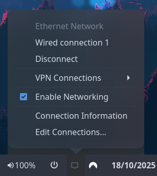
Example
{ end = [{ type = "tray" direction = "top_to_bottom" }]}{ "end": [ { "type": "tray", "direction": "top_to_bottom" } ]}end: - type: tray direction: top_to_bottom[[end]]type = "tray"direction = "top_to_bottom"Configuration
Type:
tray
direction
Section titled “direction”The direction in which to pack tray icons.
Type: 'horizontal' | 'vertical'
Default: None
icon_size
Section titled “icon_size”Size in pixels to display the tray icons as.
Type: integer
Default: 16
prefer_theme_icons
Section titled “prefer_theme_icons”Requests that icons from the theme be used over the item-provided item. Most items only provide one or the other so this will have no effect in most circumstances.
Type: boolean
Default: true
Click Actions
Click actions can be one of the following built-in actions, or any custom shell command:
Built-in actions:
menu- Opens the tray icon’s popup menudefault- Triggers the tray icon’s default (primary) actionsecondary- Triggers the tray icon’s secondary actionnone- Do nothing
Custom commands:
Any other string is treated as a custom shell command. Custom commands support the following placeholders:
{name}- The tray item’s identifier/name{title}- The tray item’s title (if available){icon}- The tray item’s icon name (if available){address}- The tray item’s internal address
Examples:
{ type = "tray" on_click_left = "menu" on_click_left_double = "default"}{ "type": "tray", "on_click_left": "menu", "on_click_left_double": "default"}type: trayon_click_left: menuon_click_left_double: defaulttype = "tray"on_click_left = "menu"on_click_left_double = "default"To run custom commands based on which tray item was clicked:
{ type = "tray" on_click_left = "notify-send 'Clicked {name}'" on_click_middle = "if [ '{name}' = 'copyq' ]; then copyq toggle; fi"}{ "type": "tray", "on_click_left": "notify-send 'Clicked {name}'", "on_click_middle": "if [ '{name}' = 'copyq' ]; then copyq toggle; fi"}type: trayon_click_left: notify-send 'Clicked {name}'on_click_middle: if [ '{name}' = 'copyq' ]; then copyq toggle; fitype = "tray"on_click_left = "notify-send 'Clicked {name}'"on_click_middle = "if [ '{name}' = 'copyq' ]; then copyq toggle; fi"Styling
| Selector | Description |
|---|---|
.tray | Tray widget box |
.tray .item | Tray icon button |
.tray .item.urgent | Tray icon button (needs attention) |
For more information on styling, please see the styling guide.