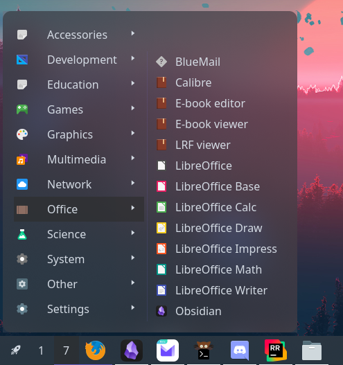
Menu
Application menu that shows installed programs and optionally custom entries.
This works by reading all .desktop files on the system.
Clicking the menu button will open the main menu. Clicking on any application category will open a sub-menu with any installed applications that match.
It is also possible to add custom categories and actions into the menu.
Example
{ start = [ { type = "menu" start = [ { type = "custom" label = "Terminal" on_click = "xterm" } ] height = 440 width = 200 icon = "archlinux" label = null } ]}{ "start": [ { "type": "menu", "start": [ { "type": "custom", "label": "Terminal", "on_click": "xterm" } ], "height": 440, "width": 200, "icon": "archlinux", "label": null } ]}start: - type: menu start: - type: custom label: Terminal on_click: xterm height: 440 width: 200 icon: archlinux label: null[[start]]type = "menu"height = 440width = 200icon = "archlinux"
[[start.start]] type = "custom" label = "Terminal" on_click = "xterm"Configuration
centerEnum
Section titled “centerEnum”Items to add to the start of the main menu.
By default, this shows a number of XDG entries that should cover all common applications.
Type: Array ()
Default: None
1xdg_entry
Section titled “1xdg_entry”Contains all applications matching the configured categories.
Object keys
xdg_entry.categories
Section titled “xdg_entry.categories”XDG categories the associated submenu should contain.
Type: Array (string)
Default: []
xdg_entry.icon
Section titled “xdg_entry.icon”Name of the image icon to show next to the label.
Type: string
Default: None
xdg_entry.label
Section titled “xdg_entry.label”Text to display on the button.
Type: string
Default: None
2xdg_other
Section titled “2xdg_other”Contains all applications not covered by xdg_entry categories.
3custom
Section titled “3custom”Individual shell command entry.
Object keys
custom.icon
Section titled “custom.icon”Name of the image icon to show next to the label.
Type: string
Default: None
custom.label
Section titled “custom.label”Text to display on the button.
Type: string
Default: None
custom.on_click
Section titled “custom.on_click”Shell command to execute when the button is clicked.
This is run using sh -c.
Type: string
Default: None
endEnum
Section titled “endEnum”Items to add to the end of the main menu.
Type: Array ()
Default: None
1xdg_entry
Section titled “1xdg_entry”Contains all applications matching the configured categories.
Object keys
xdg_entry.categories
Section titled “xdg_entry.categories”XDG categories the associated submenu should contain.
Type: Array (string)
Default: []
xdg_entry.icon
Section titled “xdg_entry.icon”Name of the image icon to show next to the label.
Type: string
Default: None
xdg_entry.label
Section titled “xdg_entry.label”Text to display on the button.
Type: string
Default: None
2xdg_other
Section titled “2xdg_other”Contains all applications not covered by xdg_entry categories.
3custom
Section titled “3custom”Individual shell command entry.
Object keys
custom.icon
Section titled “custom.icon”Name of the image icon to show next to the label.
Type: string
Default: None
custom.label
Section titled “custom.label”Text to display on the button.
Type: string
Default: None
custom.on_click
Section titled “custom.on_click”Shell command to execute when the button is clicked.
This is run using sh -c.
Type: string
Default: None
height
Section titled “height”Fixed height of the menu.
When set, if the number of (sub)menu entries exceeds this value, a scrollbar will be shown.
Leave null to resize dynamically.
Type: integer
Default: None
Label to show on the menu button on the bar.
Type: string
Default: ≡
label_icon
Section titled “label_icon”Icon to show on the menu button on the bar.
Type: string
Default: None
label_icon_size
Section titled “label_icon_size”Size of the label_icon image.
Type: integer
Default: 16
launch_command
Section titled “launch_command”Command used to launch applications.
Type: string
Default: gtk-launch {app_name}
startEnum
Section titled “startEnum”Items to add to the start of the main menu.
Type: Array ()
Default: None
1xdg_entry
Section titled “1xdg_entry”Contains all applications matching the configured categories.
Object keys
xdg_entry.categories
Section titled “xdg_entry.categories”XDG categories the associated submenu should contain.
Type: Array (string)
Default: []
xdg_entry.icon
Section titled “xdg_entry.icon”Name of the image icon to show next to the label.
Type: string
Default: None
xdg_entry.label
Section titled “xdg_entry.label”Text to display on the button.
Type: string
Default: None
2xdg_other
Section titled “2xdg_other”Contains all applications not covered by xdg_entry categories.
3custom
Section titled “3custom”Individual shell command entry.
Object keys
custom.icon
Section titled “custom.icon”Name of the image icon to show next to the label.
Type: string
Default: None
custom.label
Section titled “custom.label”Text to display on the button.
Type: string
Default: None
custom.on_click
Section titled “custom.on_click”Shell command to execute when the button is clicked.
This is run using sh -c.
Type: string
Default: None
truncateEnum
Section titled “truncateEnum”Truncate options to apply to (sub)menu item labels.
See truncate options.
Default: None
Do not truncate content.
Setting this option may cause excessively long content to overflow other widgets, shifting them off-screen.
Example
Section titled “Example”{ truncate = "off" }{ "truncate": "off"}truncate: offtruncate = "off"2'none' | 'start' | 'middle' | 'end'
Section titled “2'none' | 'start' | 'middle' | 'end'”Auto mode lets GTK decide when to ellipsize.
To use this mode, set the truncate option to a string declaring the location to truncate text from and place the ellipsis.
Example
Section titled “Example”{ truncate = "start" }{ "truncate": "start"}truncate: starttruncate = "start"3object
Section titled “3object”Length mode defines a fixed point at which to ellipsize.
Generally you will want to set only one of length or max_length,
but you can set both if required.
Example
Section titled “Example”{ truncate.mode = "start" truncate.length = 50 truncate.max_length = 70}{ "truncate": { "mode": "start", "length": 50, "max_length": 70 }}truncate: mode: start length: 50 max_length: 70[truncate]mode = "start"length = 50max_length = 70Object keys
object.length
Section titled “object.length”The fixed width (in characters) of the widget.
The widget will be expanded to this width if it would have otherwise been smaller.
Leave unset to let GTK automatically handle.
Type: integer
Default: None
object.max_length
Section titled “object.max_length”The maximum number of characters to show before truncating.
Leave unset to let GTK automatically handle.
Type: integer
Default: None
object.modeRequired
Section titled “object.modeRequired”The location to truncate text from and place the ellipsis.
Type: 'none' | 'start' | 'middle' | 'end'
Default: None
Fixed width of the menu.
Can be used with truncate options
to customise how item labels are truncated.
Type: integer
Default: None
Styling
| Selector | Description |
|---|---|
.menu | Menu button |
.popup-menu | Main container of the popup |
.popup-menu .main | Main menu of the menu |
.popup-menu .main .category | Category button |
.popup-menu .main .category.open | Open category button |
.popup-menu .main .main-start | Container for start entries |
.popup-menu .main .main-center | Container for center entries |
.popup-menu .main .main-end | Container for end entries |
.popup-menu .sub-menu | All sub-menus |
.popup-menu .sub-menu .application | Application button within submenu |
For more information on styling, please see the styling guide.