Volume
Displays the current volume level.
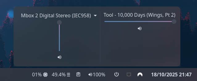
Clicking on the widget opens a volume mixer, which allows you to change the device output level,
the default playback device, and control application volume levels individually.
Use truncate or marquee options to control the display of application titles in the volume mixer.
Example
{ end = [ { type = "volume" format = "{icon} {percentage}%" max_volume = 100 truncate = "end" icons.volume_high = "" icons.volume_medium = "" icons.volume_low = "" icons.muted = "" } ]}{ "end": [ { "type": "volume", "format": "{icon} {percentage}%", "max_volume": 100, "truncate": "end", "icons": { "volume_high": "", "volume_medium": "", "volume_low": "", "muted": "" } } ]}end: - type: volume format: "{icon} {percentage}%" max_volume: 100 truncate: end icons: volume_high: volume_medium: volume_low: muted: [[end]]type = "volume"format = "{icon} {percentage}%"max_volume = 100truncate = "end"
[end.icons] volume_high = "" volume_medium = "" volume_low = "" muted = ""Configuration
Type:
volume
format
Section titled “format”The format string to use for the widget button label. For available tokens, see below.
Type: string
Default: {icon} {percentage}%
Volume state icons.
See icons.
Default: None
Object keys
icons.muted
Section titled “icons.muted”Icon to show for muted outputs.
Type: string
Default:
icons.volume_high
Section titled “icons.volume_high”Icon to show for high volume levels.
Type: string
Default:
icons.volume_low
Section titled “icons.volume_low”Icon to show for low volume levels.
Type: string
Default:
icons.volume_medium
Section titled “icons.volume_medium”Icon to show for medium volume levels.
Type: string
Default:
justify
Section titled “justify”The justification (alignment) of the widget text shown on the bar.
Type: 'left' | 'right' | 'center' | 'fill'
Default: 'left'
marquee
Section titled “marquee”See marquee options.
Default: None
Object keys
marquee.enable
Section titled “marquee.enable”Whether to enable scrolling on long lines of text. This may not be supported by all modules.
Type: boolean
Default: None
marquee.max_length
Section titled “marquee.max_length”The maximum length of text (roughly, in characters) before it gets truncated and starts scrolling.
Type: integer
Default: None
marquee.on_hoverEnum
Section titled “marquee.on_hoverEnum”Controls marquee behavior on hover.
Options:
"none": Always scroll (default)"pause": Pause scrolling on hover"play": Only scroll on hover
Default: None
Scrolling is always active, hover has no effect.
2pause
Section titled “2pause”Scrolling pauses when the widget is hovered.
Scrolling only occurs when the widget is hovered.
marquee.pause_duration
Section titled “marquee.pause_duration”Duration in milliseconds to pause at each loop point.
Type: integer
Default: 5000
marquee.scroll_speed
Section titled “marquee.scroll_speed”Scroll speed in pixels per frame. Higher values scroll faster.
Type: number
Default: 0.5
marquee.separator
Section titled “marquee.separator”String displayed between the end and beginning of text as it loops.
Type: string
Default:
max_volume
Section titled “max_volume”Maximum value to allow volume sliders to reach. Pulse supports values > 100 but this may result in distortion.
Type: number
Default: 100
orientation
Section titled “orientation”The orientation to display the widget contents. Setting to vertical will rotate text 90 degrees.
Type: 'horizontal' | 'vertical'
Default: 'horizontal'
truncateEnum
Section titled “truncateEnum”See truncate options.
Default: None
Do not truncate content.
Setting this option may cause excessively long content to overflow other widgets, shifting them off-screen.
Example
Section titled “Example”{ truncate = "off" }{ "truncate": "off"}truncate: offtruncate = "off"2'none' | 'start' | 'middle' | 'end'
Section titled “2'none' | 'start' | 'middle' | 'end'”Auto mode lets GTK decide when to ellipsize.
To use this mode, set the truncate option to a string declaring the location to truncate text from and place the ellipsis.
Example
Section titled “Example”{ truncate = "start" }{ "truncate": "start"}truncate: starttruncate = "start"3object
Section titled “3object”Length mode defines a fixed point at which to ellipsize.
Generally you will want to set only one of length or max_length,
but you can set both if required.
Example
Section titled “Example”{ truncate.mode = "start" truncate.length = 50 truncate.max_length = 70}{ "truncate": { "mode": "start", "length": 50, "max_length": 70 }}truncate: mode: start length: 50 max_length: 70[truncate]mode = "start"length = 50max_length = 70Object keys
object.length
Section titled “object.length”The fixed width (in characters) of the widget.
The widget will be expanded to this width if it would have otherwise been smaller.
Leave unset to let GTK automatically handle.
Type: integer
Default: None
object.max_length
Section titled “object.max_length”The maximum number of characters to show before truncating.
Leave unset to let GTK automatically handle.
Type: integer
Default: None
object.modeRequired
Section titled “object.modeRequired”The location to truncate text from and place the ellipsis.
Type: 'none' | 'start' | 'middle' | 'end'
Default: None
Styling
| Selector | Description |
|---|---|
.volume | Volume widget button. |
.popup-volume | Volume popup box. |
.popup-volume .device-box | Box for the device volume controls. |
.popup-volume .device-box .device-selector | Default device dropdown selector. |
.popup-volume .device-box .slider | Device volume slider. |
.popup-volume .device-box .btn-mute | Device volume mute toggle button. |
.popup-volume .apps-box | Parent box for the application volume controls. |
.popup-volume .apps-box .app-box | Box for an individual application volume controls. |
.popup-volume .apps-box .app-box .title | Name of the application playback stream. |
.popup-volume .apps-box .app-box .slider | Application volume slider. |
.popup-volume .apps-box .app-box .btn-mute | Application volume mute toggle button. |
For more information on styling, please see the styling guide.