Volume
Displays the current volume level.
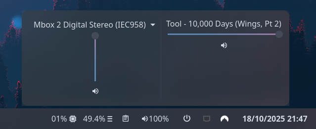
Clicking on the widget opens a volume mixer, which allows you to change the device output level,
the default playback device, and control application volume levels individually.
Use truncate_popup or marquee options to control the display of application titles in the volume mixer.
Use truncate_popup option to control the display of sink and sources in the volume mixer.
Use truncate option to control the display of the format in the bar.
This requires PulseAudio to function (pipewire-pulse is supported).
Jargon
The volume module uses PulseAudio under the hood and therefore inherits some of its termonology to define its behavior and implementation. Here are a few common terms related that pulseaudio uses to describe sources of audio:
Sink= a sound device producing audio coming out of your machine (speakers)Source= sound device receiving audio going into your machine (microphone)SinkInput= an application/program sending sound to an existing sink (app using speakers)SourceOutput= an application/program receiving audio from a source (app using microphone)
Configuration
Type:
volume
| Name | Type | Default | Profile? | Description |
|---|---|---|---|---|
format | string | {icon} {percentage}% | No | Format string to use for the widget button label. |
mute_format | string | {icon} {percentage}% | No | Variant format string to use for the widget button label when muted. |
popup_orientation | 'vertical' or 'horizontal' | horizontal | No | The orientation of the popup elements. |
sink_slider_orientation | 'vertical' or 'horizontal' | vertical | No | The orientation of the sink slider. |
source_slider_orientation | 'vertical' or 'horizontal' | vertical | No | The orientation of the source slider. |
show_sinks | bool | true | No | Show sinks (speakers) on the bar and in the popup. |
show_sources | bool | true | No | Show sources (microphones) on the bar and in the popup. |
show_monitors | bool | false | No | Show pulseaudio sink monitors for mic outputs. |
max_volume | float | 100 | No | Maximum value to allow volume sliders to reach. Pulse supports values > 100 but this may result in distortion. |
icons.volume | string | | Yes | Icon to show for high volume levels. |
icons.muted | string | | Yes | Icon to show for muted outputs. |
icons.mic_volume | string | | Yes | Icon to show for high microphone volume levels. |
icons.mic_muted | string | | Yes | Icon to show for muted microphone inputs. |
truncate_popup | 'start' or 'middle' or 'end' or off or Map | off | No | The location of the ellipses and where to truncate text from. Leave null to avoid truncating. Use the long-hand Map version if specifying a length. Takes precedence over marquee if both are configured. This option applies to sources and sinks in the popup window. See truncate for configuration options. |
truncate | 'start' or 'middle' or 'end' or off or Map | off | No | The location of the ellipses and where to truncate text from. Leave null to avoid truncating. Use the long-hand Map version if specifying a length. Takes precedence over marquee if both are configured. This option applies to format and mute_format. |
truncate.mode | 'start' or 'middle' or 'end' or off | off | No | The location of the ellipses and where to truncate text from. Leave null to avoid truncating. |
truncate.length | integer | null | No | The fixed width (in chars) of the widget. Leave blank to let GTK automatically handle. |
truncate.max_length | integer | null | No | The maximum number of characters before truncating. Leave blank to let GTK automatically handle. |
marquee | Map | false | No | Options for enabling and configuring a marquee (scrolling) effect for long text. Ignored if truncate is configured. |
marquee.enable | bool | false | No | Whether to enable a marquee effect. |
marquee.max_length | integer | null | No | The maximum length of text (roughly, in characters) before it gets truncated and starts scrolling. |
marquee.scroll_speed | float | 0.5 | No | Scroll speed in pixels per frame. Higher values scroll faster. |
marquee.pause_duration | integer | 5000 | No | Duration in milliseconds to pause at each loop point. |
marquee.separator | string | " " | No | String displayed between the end and beginning of text as it loops. |
marquee.on_hover | 'none' or 'pause' or 'play' | 'none' | No | Controls marquee behavior on hover: 'none' (always scroll), 'pause' (pause on hover), or 'play' (only scroll on hover). |
use_default_profiles | boolean | true | No | Whether default profiles should be used. |
This module uses the volume percentage 0-100 for profile thresholds.
Information on the profiles system can be found here.
JSON
{ "end": [ { "type": "volume", "format": "{icon} {percentage}%", "sink_slider_orientation": "vertical", "max_volume": 100, "truncate": "end", "truncate_popup": "middle", "icons": { "volume": "", "muted": "" }, "profiles": { "medium": { "when": 66.66, "icons": { "volume": "" } }, "low": { "when": 33.33, "icons": { "volume": "" } } } } ]}TOML
[[end]]type = "volume"format = "{icon} {percentage}%"sink_slider_orientation = "vertical"max_volume = 100truncate_popup = "end"
[end.truncate]mode = "end"max_length = 25
[end.icons]volume = ""muted = ""
[end.profiles.medium]when = 66.66
[end.profiles.medium.icons]volume = ""
[end.profiles.low]when = 33.33
[end.profiles.low.icons]volume = ""YAML
end: - type: volume format: '{icon} {percentage}%' sink_slider_orientation: vertical max_volume: 100 truncate: end truncate_popup: end icons: volume: muted: profiles: medium: when: 66.66 icons: volume: low: when: 33.33 icons: volume: Corn
{ end = [ { type = "volume" format = "{icon} {percentage}%" sink_slider_orientation = "vertical" max_volume = 100 truncate = "end" truncate_popup = "end" icons.volume = "" icons.muted = ""
profiles = { medium.when = 66.66 medium.icons.volume = ""
low.when = 33.33 low.icons.volume = "" } } ]}{ "end": [ { "type": "volume", "format": "{icon} {percentage}%", "sink_slider_orientation": "vertical", "max_volume": 100, "truncate": "end", "truncate_popup": "end", "icons": { "volume": "", "muted": "" }, "profiles": { "medium": { "when": 66.66, "icons": { "volume": "" } }, "low": { "when": 33.33, "icons": { "volume": "" } } } } ]}end: - type: volume format: "{icon} {percentage}%" sink_slider_orientation: vertical max_volume: 100 truncate: end truncate_popup: end icons: volume: muted: profiles: medium: when: 66.66 icons: volume: low: when: 33.33 icons: volume: [[end]]type = "volume"format = "{icon} {percentage}%"sink_slider_orientation = "vertical"max_volume = 100truncate = "end"truncate_popup = "end"
[end.icons] volume = "" muted = ""
[end.profiles.medium]when = 66.66
[end.profiles.medium.icons] volume = ""
[end.profiles.low]when = 33.33
[end.profiles.low.icons] volume = ""Default profiles
{ low.when = 33.33 low.icons.volume = ""
medium.when = 66.66 medium.icons.volume = ""}{ "low": { "when": 33.33, "icons": { "volume": "" } }, "medium": { "when": 66.66, "icons": { "volume": "" } }}low: when: 33.33 icons: volume: medium: when: 66.66 icons: volume: [low]when = 33.33
[low.icons] volume = ""
[medium]when = 66.66
[medium.icons] volume = ""Formatting Tokens
The following tokens can be used in the format config option:
| Token | Description |
|---|---|
{percentage} | The active device volume percentage. |
{icon} | The icon representing the current volume. |
{name} | The active device name. |
Styling
| Selector | Description |
|---|---|
.volume | Volume widget button. |
.volume .sink | Volume widget sink (speaker) label. |
.volume .source | Volume widget source (microphone) label. |
.popup-volume | Volume popup box. |
.popup-volume .device-box | Box for the device volume controls. |
.popup-volume .device-box .sink-box | Box for the sink volume controls. |
.popup-volume .device-box .source-box | Box for the source volume controls. |
.popup-volume .device-box .device-selector | Default device dropdown selector. |
.popup-volume .device-box .slider | Device volume slider. |
.popup-volume .device-box .btn-mute | Device volume mute toggle button. |
.popup-volume .apps-box | Parent box for the application volume controls. |
.popup-volume .apps-box .sink-input-box | Parent box for the application volume controls (sink inputs). |
.popup-volume .apps-box .source-output-box | Parent box for the application volume controls (source outputs). |
.popup-volume .apps-box .app-box | Box for an individual application volume controls (all). |
.popup-volume .apps-box .app-box.input-box | Box for an individual application volume controls (sink input only). |
.popup-volume .apps-box .app-box.output-box | Box for an individual application volume controls (source output only). |
.popup-volume .apps-box .app-box .title | Name of the application playback stream. |
.popup-volume .apps-box .app-box .slider | Application volume slider. |
.popup-volume .apps-box .app-box .btn-mute | Application volume mute toggle button. |
For more information on styling, please see the styling guide.