Volume
Displays the current volume level.
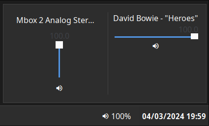
Clicking on the widget opens a volume mixer, which allows you to change the device output level,
the default playback device, and control application volume levels individually.
Use truncate option to control the display of application titles in the volume mixer.
This requires PulseAudio to function (pipewire-pulse is supported).
Configuration
Type:
volume
| Name | Type | Default | Description |
|---|---|---|---|
format | string | {icon} {percentage}% | Format string to use for the widget button label. |
max_volume | float | 100 | Maximum value to allow volume sliders to reach. Pulse supports values > 100 but this may result in distortion. |
icons.volume_high | string | | Icon to show for high volume levels. |
icons.volume_medium | string | | Icon to show for medium volume levels. |
icons.volume_low | string | | Icon to show for low volume levels. |
icons.muted | string | | Icon to show for muted outputs. |
truncate | 'start' or 'middle' or 'end' or off or Map | off | The location of the ellipses and where to truncate text from. Leave null to avoid truncating. Use the long-hand Map version if specifying a length. |
truncate.mode | 'start' or 'middle' or 'end' or off | off | The location of the ellipses and where to truncate text from. Leave null to avoid truncating. |
truncate.length | integer | null | The fixed width (in chars) of the widget. Leave blank to let GTK automatically handle. |
truncate.max_length | integer | null | The maximum number of characters before truncating. Leave blank to let GTK automatically handle. |
JSON
{ "end": [ { "type": "volume", "format": "{icon} {percentage}%", "max_volume": 100, "truncate": "middle", "icons": { "volume_high": "", "volume_medium": "", "volume_low": "", "muted": "" } } ]}TOML
[[end]]type = "volume"format = "{icon} {percentage}%"max_volume = 100truncate = "middle"
[end.icons]volume_high = ""volume_medium = ""volume_low = ""muted = ""YAML
end: - type: "volume" format: "{icon} {percentage}%" max_volume: 100 truncate: "middle" icons: volume_high: "" volume_medium: "" volume_low: "" muted: ""Corn
{ end = [ { type = "volume" format = "{icon} {percentage}%" max_volume = 100 truncate = "end" icons.volume_high = "" icons.volume_medium = "" icons.volume_low = "" icons.muted = "" } ]}{ "end": [ { "type": "volume", "format": "{icon} {percentage}%", "max_volume": 100, "truncate": "end", "icons": { "volume_high": "", "volume_medium": "", "volume_low": "", "muted": "" } } ]}end: - type: volume format: "{icon} {percentage}%" max_volume: 100 truncate: end icons: volume_high: volume_medium: volume_low: muted: [[end]]type = "volume"format = "{icon} {percentage}%"max_volume = 100truncate = "end"
[end.icons] volume_high = "" volume_medium = "" volume_low = "" muted = ""Formatting Tokens
The following tokens can be used in the format config option:
| Token | Description |
|---|---|
{percentage} | The active device volume percentage. |
{icon} | The icon representing the current volume. |
{name} | The active device name. |
Styling
| Selector | Description |
|---|---|
.volume | Volume widget button. |
.popup-volume | Volume popup box. |
.popup-volume .device-box | Box for the device volume controls. |
.popup-volume .device-box .device-selector | Default device dropdown selector. |
.popup-volume .device-box .slider | Device volume slider. |
.popup-volume .device-box .btn-mute | Device volume mute toggle button. |
.popup-volume .apps-box | Parent box for the application volume controls. |
.popup-volume .apps-box .app-box | Box for an individual application volume controls. |
.popup-volume .apps-box .app-box .title | Name of the application playback stream. |
.popup-volume .apps-box .app-box .slider | Application volume slider. |
.popup-volume .apps-box .app-box .btn-mute | Application volume mute toggle button. |
For more information on styling, please see the styling guide.