Volume
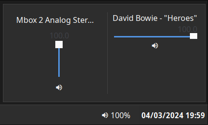
Displays the current volume level. Clicking on the widget opens a volume mixer, which allows you to change the device output level, the default playback device, and control application volume levels individually.
This requires PulseAudio to function (pipewire-pulse is supported).
Configuration
Type:
volume
| Name | Type | Default | Description |
|---|---|---|---|
format | string | {icon} {percentage}% | Format string to use for the widget button label. |
max_volume | float | 100 | Maximum value to allow volume sliders to reach. Pulse supports values > 100 but this may result in distortion. |
icons.volume_high | string | | Icon to show for high volume levels. |
icons.volume_medium | string | | Icon to show for medium volume levels. |
icons.volume_low | string | | Icon to show for low volume levels. |
icons.muted | string | | Icon to show for muted outputs. |
JSON
{ "end": [ { "type": "volume", "format": "{icon} {percentage}%", "max_volume": 100, "icons": { "volume_high": "", "volume_medium": "", "volume_low": "", "muted": "" } } ]}TOML
[[end]]type = "volume"format = "{icon} {percentage}%"max_volume = 100
[end.icons]volume_high = ""volume_medium = ""volume_low = ""muted = ""YAML
end: - type: "volume" format: "{icon} {percentage}%" max_volume: 100 icons: volume_high: "" volume_medium: "" volume_low: "" muted: ""Corn
{ end = [ { type = "volume" format = "{icon} {percentage}%" max_volume = 100 icons.volume_high = "" icons.volume_medium = "" icons.volume_low = "" icons.muted = "" } ]}{ "end": [ { "type": "volume", "format": "{icon} {percentage}%", "max_volume": 100, "icons": { "volume_high": "", "volume_medium": "", "volume_low": "", "muted": "" } } ]}end: - type: volume format: "{icon} {percentage}%" max_volume: 100 icons: volume_high: volume_medium: volume_low: muted: [[end]]type = "volume"format = "{icon} {percentage}%"max_volume = 100
[end.icons] volume_high = "" volume_medium = "" volume_low = "" muted = ""Formatting Tokens
The following tokens can be used in the format config option:
| Token | Description |
|---|---|
{percentage} | The active device volume percentage. |
{icon} | The icon representing the current volume. |
{name} | The active device name. |
Styling
| Selector | Description |
|---|---|
.volume | Volume widget button. |
.popup-volume | Volume popup box. |
.popup-volume .device-box | Box for the device volume controls. |
.popup-volume .device-box .device-selector | Default device dropdown selector. |
.popup-volume .device-box .slider | Device volume slider. |
.popup-volume .device-box .btn-mute | Device volume mute toggle button. |
.popup-volume .apps-box | Parent box for the application volume controls. |
.popup-volume .apps-box .app-box | Box for an individual application volume controls. |
.popup-volume .apps-box .app-box .title | Name of the application playback stream. |
.popup-volume .apps-box .app-box .slider | Application volume slider. |
.popup-volume .apps-box .app-box .btn-mute | Application volume mute toggle button. |
For more information on styling, please see the styling guide.